Case Study — WCAG 2.1 / 2.2 · Inclusive Design
Accessibility Audit & Redesign
Accessibility isn't a checklist you complete at the end — it's a design principle that determines who can actually use your product.

01 — The Situation
A product built for the assumed average user — not the actual one.
ValueAdd Solutions had a B2C platform that had been designed and built over three years without a structured accessibility programme. The product worked well for the majority of its users — but "the majority" is a design fiction. Real user populations include people with visual impairments, motor differences, cognitive variations, situational impairments (operating a phone with one hand, in bright sunlight, under stress), and temporary disabilities (a broken arm, a migraine).
When ValueAdd realised they were failing to serve a significant portion of potential users — and when the EU Web Accessibility Directive began applying to private-sector companies — they brought in an accessibility specialist to assess and redesign the platform.
This is a principle I hold from architectural practice. A building that can only be entered via stairs is not a building with a "disability accommodation problem" — it is a building that was designed for a fictional average person who does not exist. The same is true for digital products.
02 — My Approach
Audit first. Redesign only what the evidence demands.
I structured the engagement in two phases. Phase 1 was a comprehensive audit against WCAG 2.1 AA (with notes on WCAG 2.2 requirements as they began to apply). Phase 2 was targeted redesign — rebuilding the components and flows that failed the audit, not a wholesale visual refresh.
This is a principled choice. Accessibility work that is bundled with a visual redesign often dilutes both — the accessibility changes get compromised for aesthetic reasons, and the aesthetic work is delayed by compliance requirements. Keeping them separate ensures the audit findings drive the redesign scope, not stakeholder preference.
03 — The Audit
28 issues identified. Prioritised by impact.
The audit covered the platform's 14 core screens using a combination of automated tools (axe DevTools, WAVE), manual keyboard navigation testing, and screen reader testing with NVDA on Windows and VoiceOver on macOS. Issues were classified by WCAG criterion and by impact severity.
| WCAG Criterion | Issue | Severity | Status |
|---|---|---|---|
| 1.4.3 Contrast (Minimum) | Body text on light grey background: 2.8:1 ratio (minimum 4.5:1) | Critical | Fixed |
| 2.1.1 Keyboard | Date picker component not operable by keyboard — mouse-only interaction | Critical | Fixed |
| 1.3.1 Info and Relationships | Form fields use placeholder text as labels — disappears on input | Critical | Fixed |
| 2.4.7 Focus Visible | Focus indicators removed via CSS (outline:none) on interactive elements | Critical | Fixed |
| 4.1.2 Name, Role, Value | Icon-only buttons missing accessible names (aria-label) | Critical | Fixed |
| 1.4.4 Resize Text | Layout breaks at 200% text zoom — content overflows container | Moderate | Fixed |
| 2.4.3 Focus Order | Modal dialog focus does not move to modal on open — screen readers confused | Moderate | Fixed |
| 1.4.11 Non-text Contrast | Form field borders below 3:1 against background — invisible to low-vision users | Moderate | Fixed |
Sample from audit findings — 8 of 28 total issues documented
Sample audit documentation — each issue recorded with criterion, impact, affected users, and fix recommendation
04 — Key Decisions
Where the principles had to hold against pressure.
05 — Redesign Highlights
Better for everyone, not just for compliance.
A well-executed accessibility redesign improves the product for all users — not just those with disabilities. The persistent form labels are easier to use for everyone. The custom focus ring system helps power users navigate faster. The improved colour contrast makes the product more readable in sunlight, with tired eyes, and on low-quality screens.
Form redesign — before and after. Left: placeholder-as-label pattern. Right: persistent label with correct contrast and focus indication.
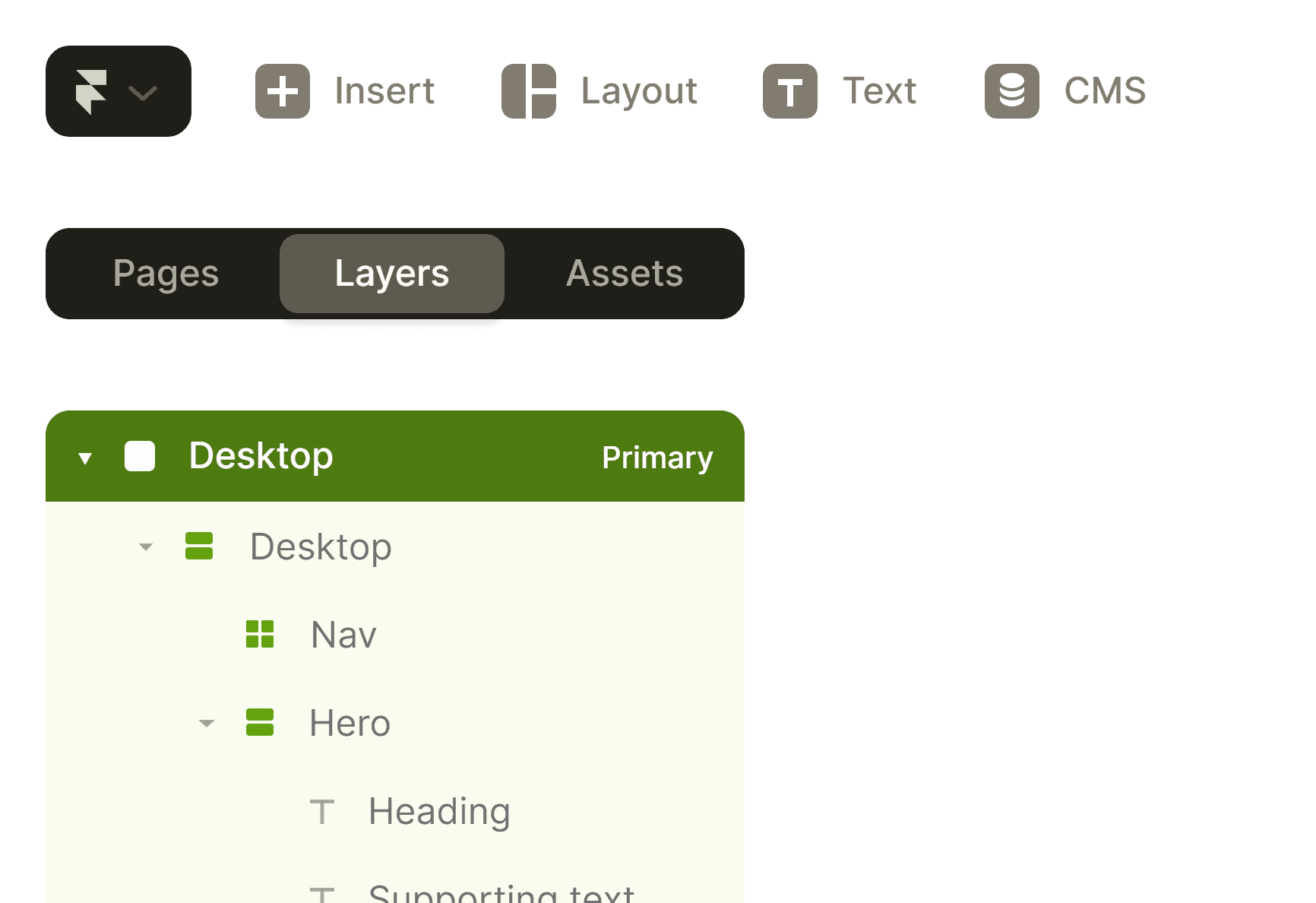
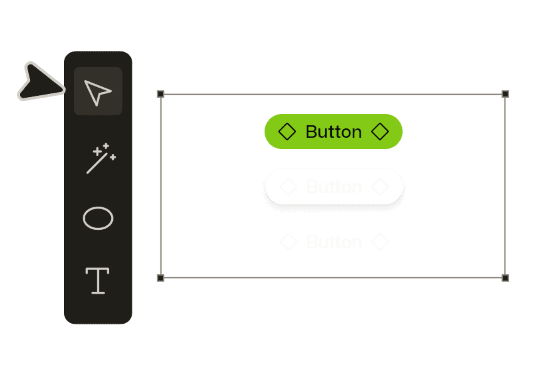
Component annotation example — full accessibility specification embedded in the design system
06 — Outcome
28 issues. 28 resolutions. One design system that holds.
The platform now meets WCAG 2.1 AA across all 14 core screens. The annotated design system gives the development team ongoing reference for maintaining compliance as the product evolves. A follow-up review six months later confirmed that new features built using the annotated components had no accessibility failures.
The most meaningful measure is not the pass/fail count. It is that people who previously could not use the platform — users navigating by keyboard, users with screen readers, users with low vision — can now complete all core tasks without workarounds.