Case Study — Financial App
PlutoPay
A comprehensive financial application that integrates banking, budgeting, and investment — designed for clarity under complexity.
01 — The Situation
Financial products are trust products first.
Managing personal finances in 2023 means juggling multiple apps — one for day-to-day banking, another for tracking spending, another for investments. Users context-switch constantly, losing the thread of their financial picture each time. PlutoPay's brief was to design a unified platform that brings all three together without overwhelming people who are not financial experts.
The challenge was familiar to me in a different domain. Designing a hospital, I learned that the stakes of a confusing interface are not aesthetic — they are functional and, at the extreme, consequential. A person making a wrong payment, missing a bill, or misreading an investment doesn't just feel frustrated. They lose money. They lose trust. They stop using the product entirely.
That framing — financial products as trust products — shaped every decision I made in this project.
02 — My Role
End-to-end: from research to hi-fi prototype.
I owned the full design process: user research, competitive analysis, information architecture, wireframing, UI design, and a clickable hi-fi prototype for both mobile and web. I also defined the component library and WCAG 2.1 accessibility standards for the product.
03 — Research & Discovery
What people say they want, and what they actually do.
I conducted user interviews with people across different financial confidence levels — from those who check their accounts daily, to people who avoid looking at their finances because it causes anxiety. The gap between these two groups was the most important finding.
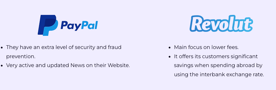
I also ran a competitive analysis across six financial apps — looking specifically at information density, error state handling, and onboarding flows. The common failure I observed: most apps optimise for the user who already knows what they're doing, at the expense of everyone else.
Research synthesis — competitive analysis across key financial apps
04 — Key Decisions
The choices that shaped the product.
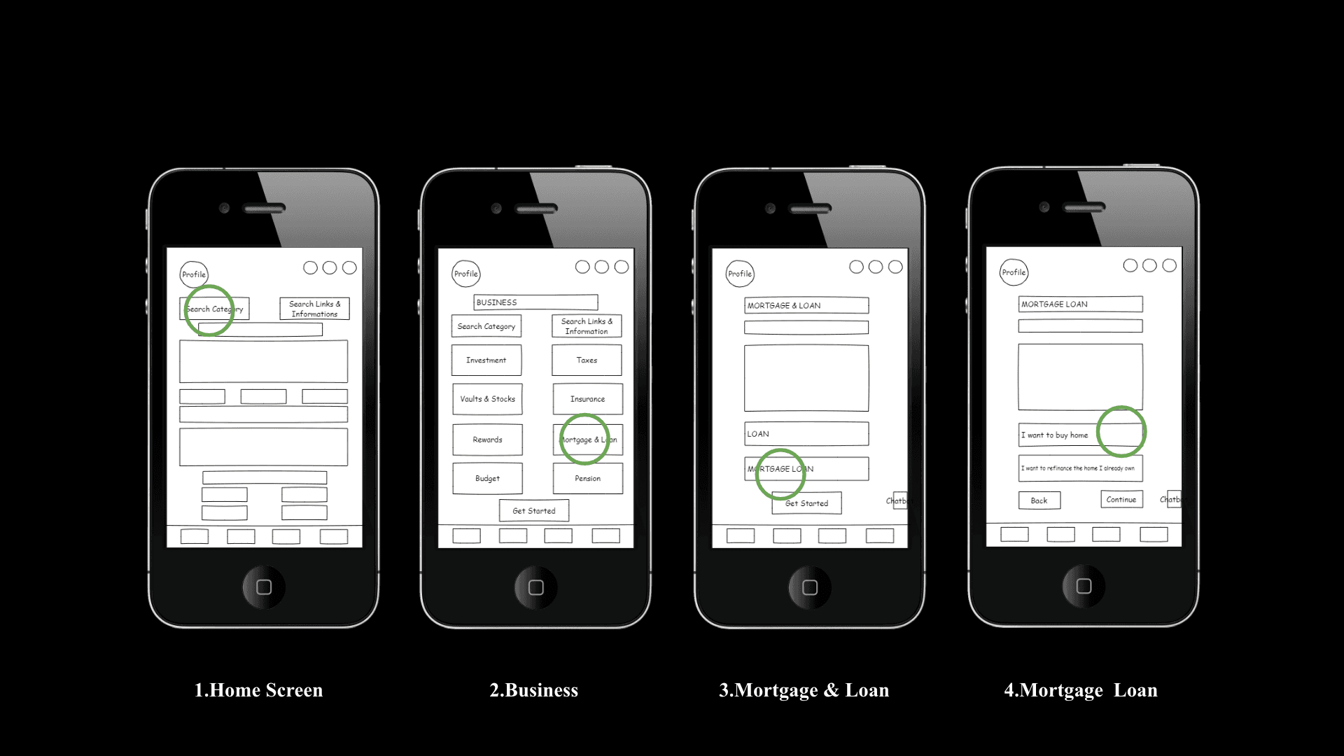
Information architecture — low-fidelity wireframes mapping the core user flows
05 — Solution Highlights
Clarity without simplification.
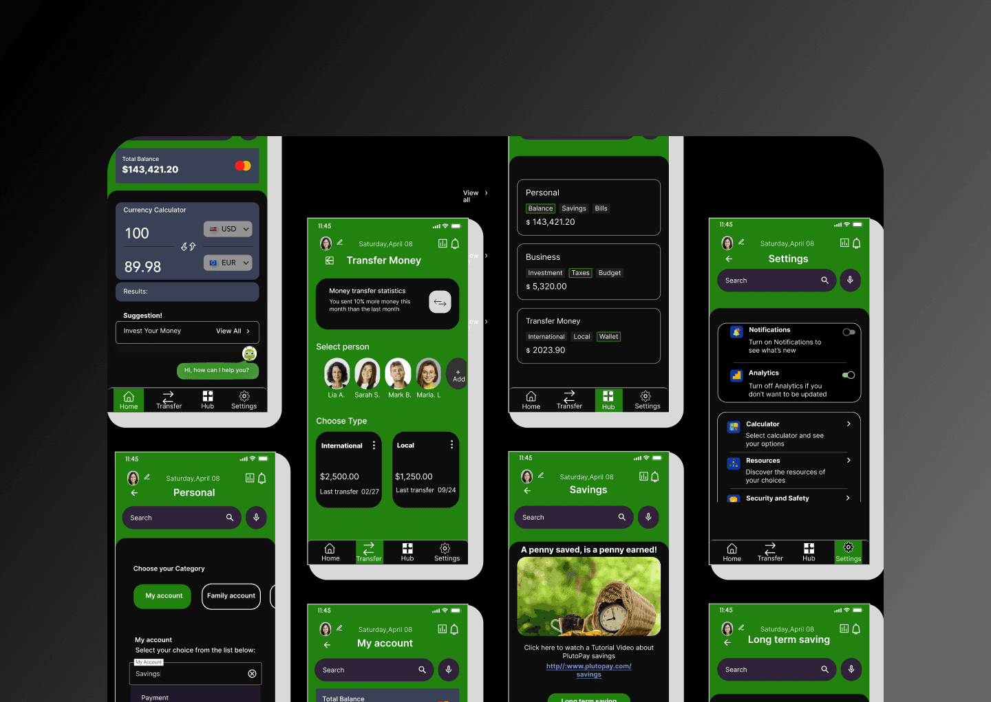
The final design is a cross-platform financial application that works equally well as a mobile app and a web dashboard. The visual system uses strong typographic hierarchy and deliberate negative space to let data breathe rather than compete.
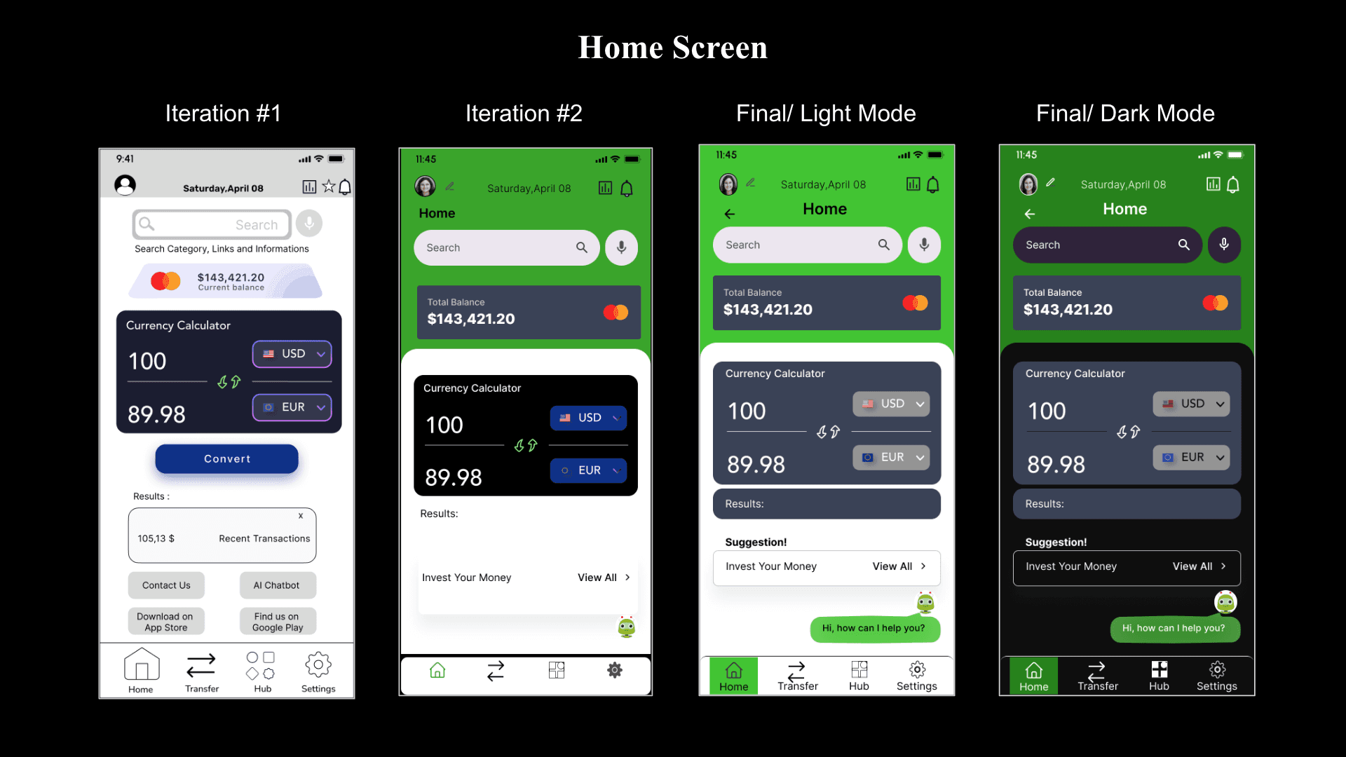
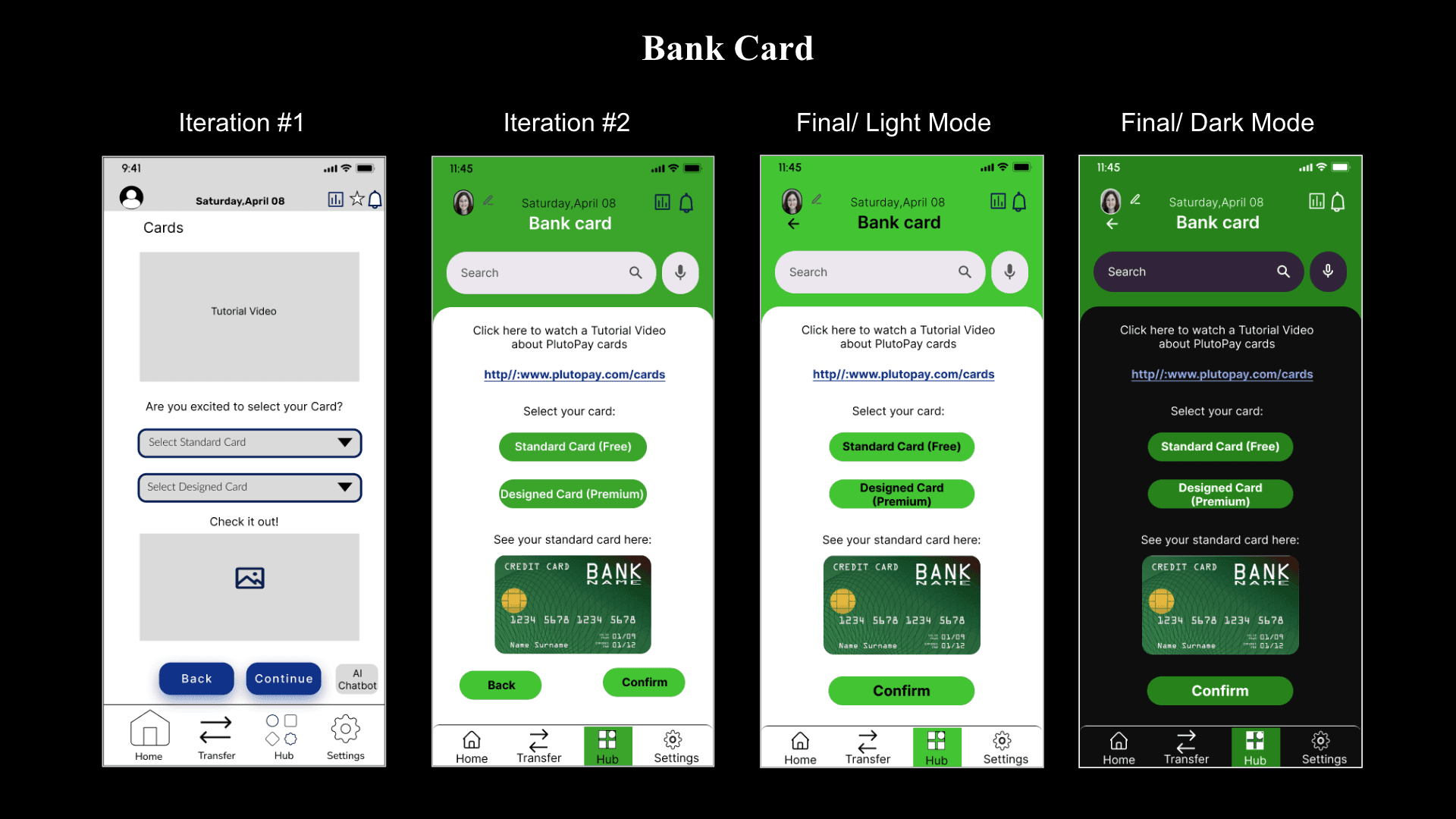
Mobile screens — home and bank card screen iterations through to final
The component library was built to WCAG 2.1 AA standard — colour contrast ratios, focus states, touch targets, and screen reader labels were all part of the specification, not added at the end. This is not unusual for financial products, where regulatory compliance often mandates accessibility; but here it was treated as a design principle, not a compliance checkbox.
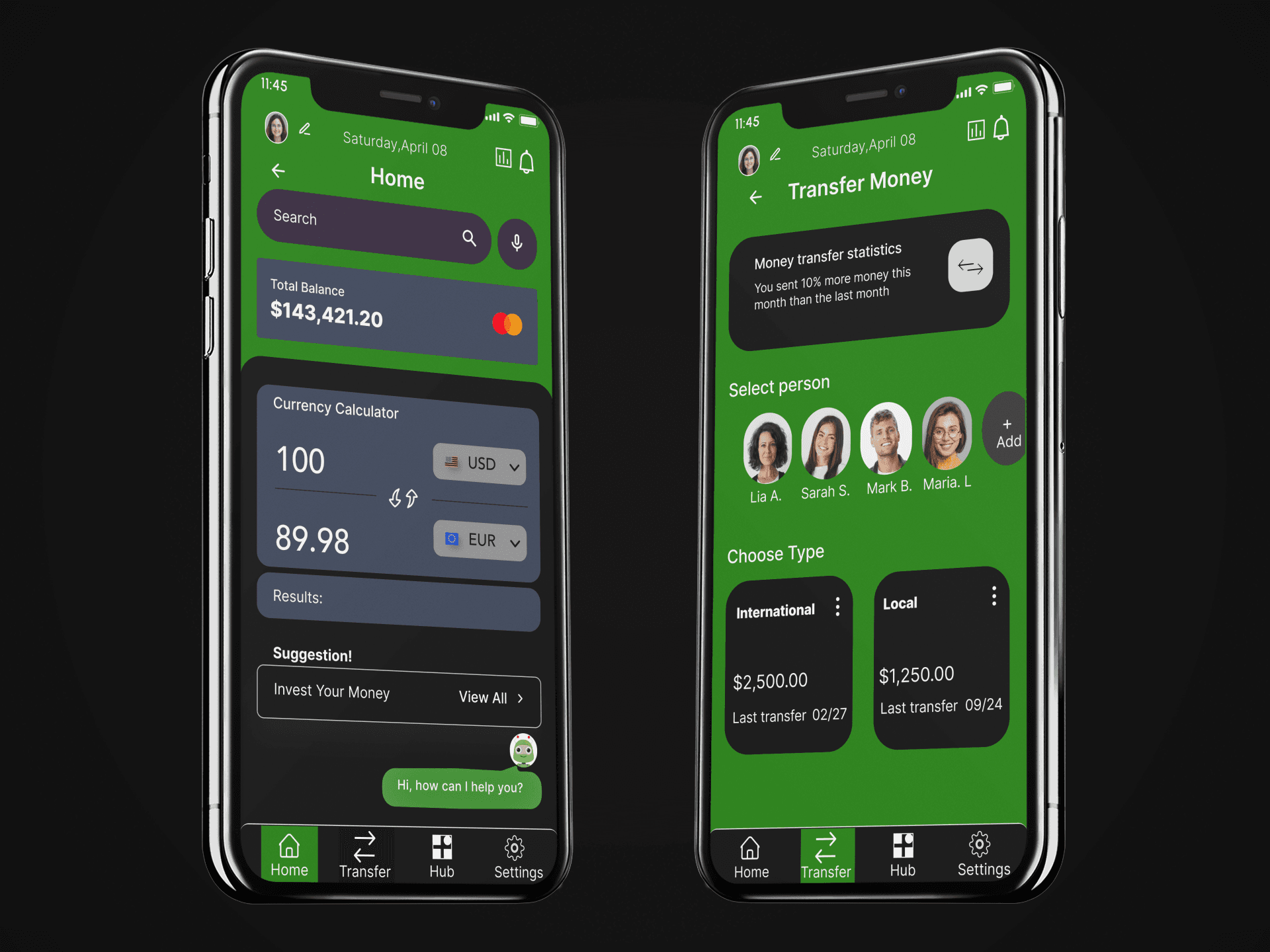
Final UI — home screen and money transfer flow
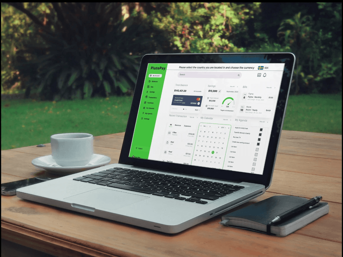
Final screens — complete UI across key flows
06 — Outcome
What changed.
The prototype was tested with five users across two rounds of usability testing. Task completion rates improved substantially between rounds one and two, driven primarily by the progressive disclosure redesign and the simplified home screen.
All five test participants successfully completed the core banking and budgeting tasks without assistance. The investment module required more guidance in round one; the progressive disclosure redesign resolved the confusion completely in round two.
07 — Reflection
What I'd do differently.
If I were to extend this project, I'd invest more time in the budgeting module — specifically, the experience of setting and managing category-level budgets. User testing revealed that people understand what a budget is, but find the act of creating one cognitively demanding. The entry-point interaction needs to be simpler.
I'd also expand the accessibility testing beyond WCAG technical compliance to include users with cognitive disabilities — a group whose needs the current design handles less explicitly, and who are disproportionately affected by confusing financial interfaces.